A poster is an excellent way of presenting complex ideas in an easy-to-understand way. Giving a quick overview of data, it acts like an "ad" for your work. Make it inviting to read with a clear message. Do not overestimate your readers' interest – the average reader spends only one minute reading a poster!
Update 2024-03-08: Templates are now available in A0 and A1 formats.
Find the template directly on your PC
If you have a SLU standard-configuration PC, the templates are available in Powerpoint under Custom/Personal. Open the "Personal" folder to access the templates and a user guide.
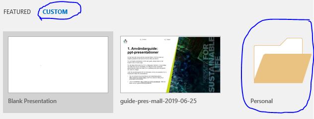
There may be invalid templates under Custom, in addition to the "Personal" folder. That is because the program saves the most recentlyt used templates there. Always make sure that you open the folder "Personal" to access the correct templates.
Formats
The poster can be landscape or portrait format. It has a header with a profile image collage and a wedge, or a colour panel and a wedge, with clear dividing lines. The area for text, images and charts can be divided into three columns or merged depending on the material.
Tips for creating posters
A poster is an excellent way of presenting complex ideas in an easy-to-understand way and to give a quick overview. Unlike a written report, you can forget about the details and focus on making your poster as interesting as possible. Make it an inviting read by having a clear message. Do not overestimate your readers' interest – the average poster reader spends only one minute reading!
Portrait or landscape?
What format to choose depends on where the poster will be displayed. Make sure you check the required size before you start designing your poster, and set the correct measurements in the software you use. If you have a choice, a landscape poster is often preferable as you can then present more text at eye level, making it easier to read.
Format
The poster format can vary depending on where the poster is going to be displayed. Make sure you check the measurements before you start designing your poster, and set the measurements in the software you use. If you have a choice, a landscape poster is often preferable as you can then present more text at eye level, making it easier to read.
Layout
- A layout that stands out will attract readers. Make use of contrasting shapes, colours and sizes. Don't be afraid of being creative, make your poster unique!
- Arrange text blocks and images to form a logical flow that the eye can easily follow.
- Never leave the reader in doubt as to what parts belong together, where to start reading and where to continue. A confused reader will quickly lose interest.
- Enforce your message by making text and image work together.
Headings
- Make the heading simple, easy to read and preferably no longer than one line.
- If the heading is too long, try dividing into a shorter heading followed by a subheading.
- Use uppercase if the heading is one line, lowercase if it is longer.
- Letters should be 4–5 cm high (appr. 170 points) to be legible from a distance.
- The SLU fonts Arial and Akzidenz Grotesk are well suited for headings.
Text
- Place the summary immediately after the heading and the name of the author.
- A suitable font size for the body text is 1 cm, which is legible from two meters.
- The text should be divided into paragraphs of approximately five lines and 40–50 characters per line.
- Use clear, informative subheadings.
- Left-align the text to avoid large gaps between words.
- Avoid abbreviations.
- The primary function of the text should be to complement the images.
- Do not fill your poster with text – instead, make sure there is plenty of whitespace as this makes the text more inviting to read.
- Avoid placing text on images, particularly body text. If the image is patterned, this will make the text difficult to read.
Tables and charts
- Use descriptive headings for tables and charts.
- All text in tables and charts should be horizontal.
Images and graphics
- A picture says more than a thousand words. The right picture can replace a long, descriptive text.
- Use high-quality images with 300 dpi at 100 per cent size.
- You need the photographer's permission to publish photographs, and you must give the photographer's name. It is not allowed to reverse an image or alter it in any other way without prior permission from the photographer.
- Always check the direction of an image, and make sure that any people in the picture are not looking "away" from the poster.
You can read more about images and image rights here.
Colours
- Do not be afraid to use colour. Strong colours can make your poster stand out, but too much colour can also mean that images do not show up as well. You will find the approved SLU colour palette here.
- A high contrast between text and background increases legibility.
Sender
- Be clear about who the sender is. Add the author's name, preferably next to a portrait, department affiliation and the SLU logotype. The SLU logotype is a quality stamp that adds value to your poster. You can download the logotype here.
- Do not forget to add contact details and references to additional information, for example on the web. Business cards and QR codes are a good complement.
See the whole picture
- The poster should be suited for use on its own, but also work as support for presentations.
- Add business cards, folders and other products.

